Perhaps the most reliable way to ‘save the planet’ is to take a picture that has been constructed by using mathematics and arithmetic; these exist in a variety of forms, but most commonly they are represented as charts or graphs that can provide at a glance, information on any subject for which there is reliable data, and graphs in particular are good at showing numerical change against a baseline of time.
I’m one of those unfortunates who have trouble adding up a column of figures – seldom do I get the same total twice – even with a calculator! That’s discouraging, but it’s not a valid excuse to give up. And mathematics doesn’t come any easier, but let’s face it, we owe it to the planet to try, because mathematics is the key to measuring everything important that is going on around us.
A politician or national spokesman who says, ‘I’m just hopeless with maths’ or ‘math’ (depending on where they are standing) and then laughs it off, should be looking elsewhere for work. There is understandable concern when the people who represent us do not usually have backgrounds in mathematics or science – political science doesn’t count, because that’s an oxymoron. Anyway, the ‘I don’t get mathematics’ excuse is unacceptable from any elected official and we should urge them to ‘try harder’.
When I heard a health spokesman say recently that the Ebola virus epidemic in West Africa was growing exponentially month by month there was obvious cause for concern. The spokesmen then gave the number of infections that occured during the previous month followed by the predicted figure for the month to follow, and the figures were exactly the same. This implied that he either didn’t understand exponential, or the increase wasn’t exponential at all. The statement was confusing: was the rate of infection steady and controllable? Or was it expanding exponentially, suggesting that heading for the hills was the best possible option?
Understanding exponential growth shouldn’t be a problem. Most small children can draw it, even if they can’t describe the outcome.
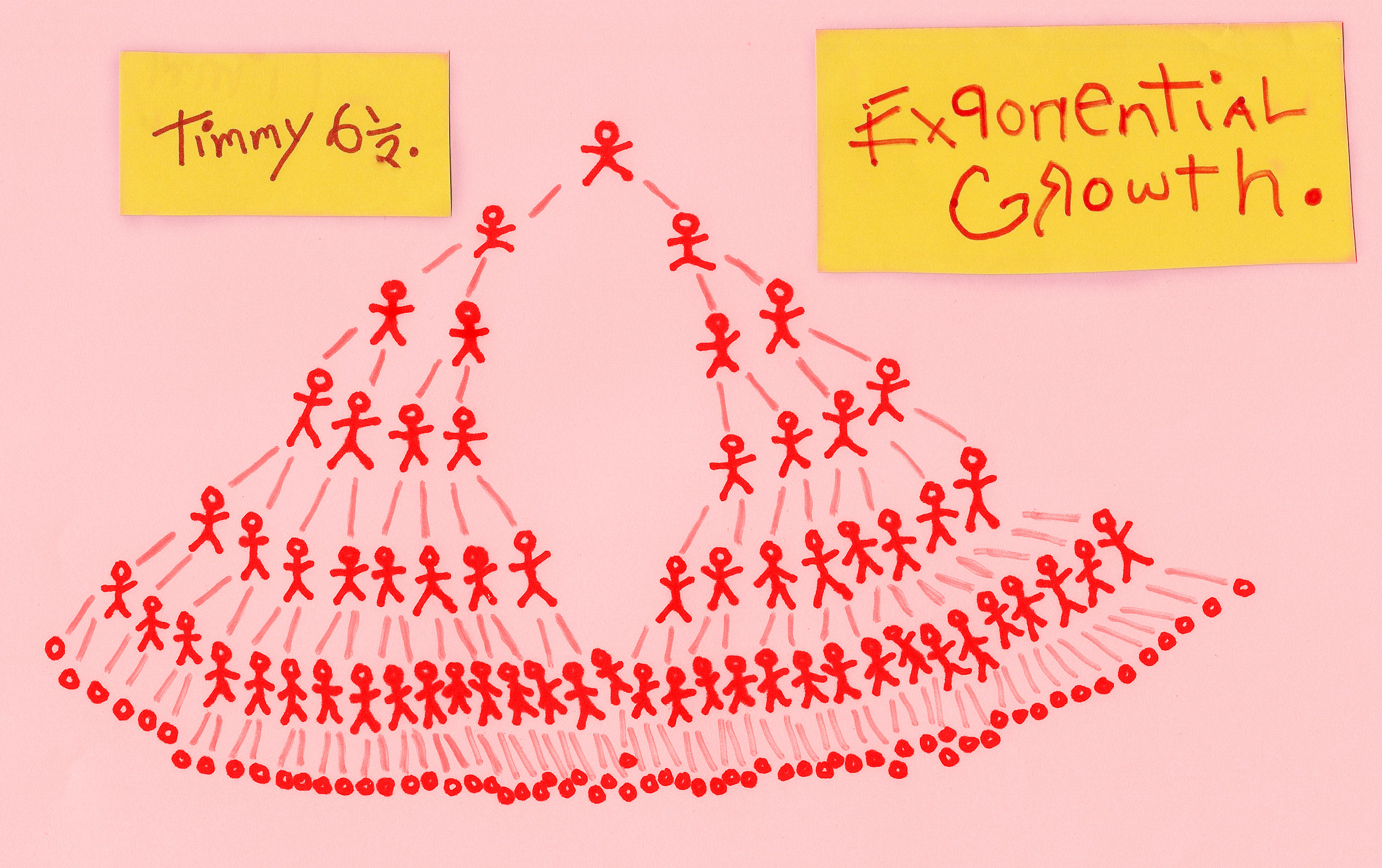
In everyday life, most people don’t think much beyond arithmetic progressions, where the increase between numbers is constant. But exponential growth is nothing like that. Once you start down the road to exponential, by doubling up, it isn’t long before the figures are mind blowingly large, and if they relate to a dangerous disease that goes unchecked, no health service on the planet will be able to deal with it.
There is an ancient Persian story that explains the process well. An inventor who pleased his king with a wonderful invention was asked to name his reward; but he at once disappointed the ruler with the seemingly meagreness of his choice. The inventor asked for grains of wheat to be placed upon a chess board in the following manner: one grain on the first square, two grains on the second, four on the third, eight on the fourth, 16 on the fifth and so on, until all of the 64 squares were covered. The numbers start small and most of us don’t think much beyond the 8th square where the total hits 128 grains, which isn’t an outrageous figure. Quite a surprise then to discover that to reach the 64th square requires 18,446,744,073,709,551,615 grains of wheat – more wheat than was available in the whole kingdom. The tale is spun as an example of intelligence winning the day, or alternatively, it is a story of cunning and greed – the inventor either becomes ruler of the kingdom, or he loses his head.
In today’s world we might relate this story to pyramid selling where an investment doubles up every move it makes down the line and before long the numbers become vast, but by then, many individuals have dropped out of the scheme and never pay their contributions, while those who stay in begin to run out of suckers to sell to.
Telling a story is a great way to explain numerical change, but an artful graphs is a more visual approach. The two graphs below are free of annotation which allows the image to pass for art if you prefer it – perhaps as a late Matisse paper collage.

The upper curve begins between yellow and red but continues for the most part between yellow and green – it starts shallow, then rises exponentially before levelling off. This forms a ‘logistic curve’ first used by Pierre Verhurst in the mid 1800s to show natural population growth where numbers are held to an upper limit by predation and availability of resources.
The lower curve that runs at first between red and yellow and then red and green takes time to rise, but when it does the line steepens rapidly – this is exponential growth that hasn’t levelled off. The world human population presently follows this ‘run away’ curve, but without infinite resources it cannot continue to grow in this manner. In a finitely resourced world the predictable result is a sudden levelling of the curve and a plummet downwards that mirrors the up. To alleviate suffering, it makes sense to control the drop – this really is a case of the higher you go the harder the fall. Birth rates are presently falling across the developed world, but for economic reasons the numbers are usually bolstered by immigration (O.K. there will then be fewer people somewhere else, but that doesn’t regulate the population in places where people are genuinely trying to control their numbers).
The logistic curve along with the wave curve (see the predator prey relationship graphs below) apply to almost any species other than our own and they have longterm benefits for both the species and the environment – and make better models for longterm regulation than does uncontrolled exponential growth. All the information we need for responsible behaviour is contained within a couple of simple graphs, indicating that self regulation of human population is a better option than the inevitable collapse that continued exponential growth has in store .
Unfortunately, governments do not run economies with a view to longterm sustainably – they invariably opt for growth above all else, and are reluctant to make changes, preferring instead to pass the parcel onto the next generation – a ticking time bomb which they’ve chosen to ignore. Economies are run as if resources are infinite and without cost beyond extraction, refining and transportation. However, at a certain point, the Earth will no longer be able to sustain this, and if the present generation continues to charge up the steep end of exponential… future generations will be forced to pay the price, and will know that we had all the information available to make the right decisions, but instead carried on, business as usual.
HERE WE ALL ARE, UP ON THE STEEPEST PART OF THE CURVE.
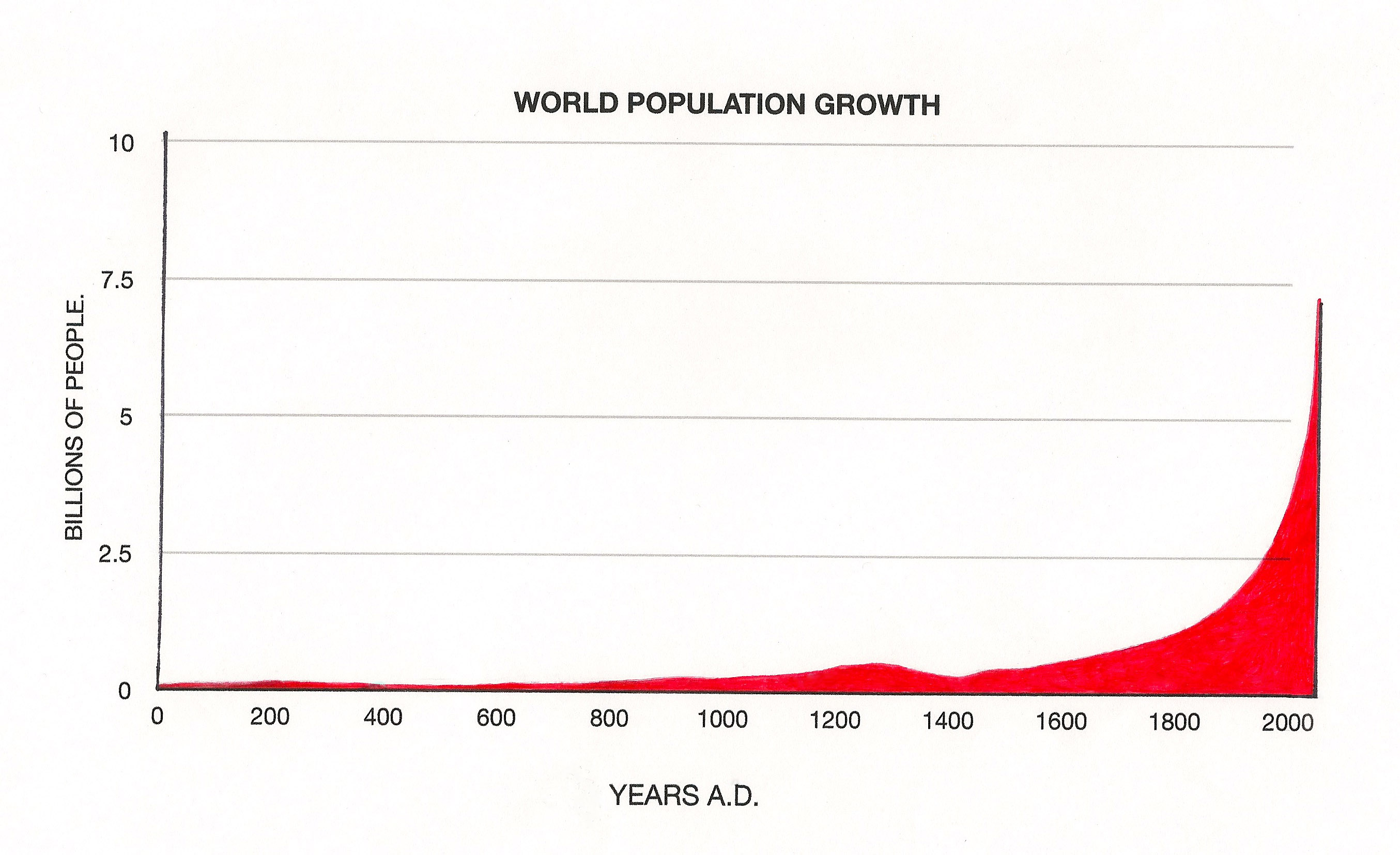
Things often start off slowly before exponential growth kicks in. With the human population nothing much changed for a very long time. There was even a period around70,000 years ago (long before the time line represented in the above graph), when the human population dropped so low we almost disappeared altogether.
It may well have been cooking meat and the development of agriculture that started things moving, but there have been other set backs: the black death was a devastating pandemic and can be seen as a dip in the population graph around 1400. Prior to the plague weather conditions around the mid-1300s were unfavourable, and throughout Europe crops repeatedly failed. It was a perfect storm of a disaster and millions died – but the loss of a third of Europe’s population did change the economy. Suddenly, there was a shortage of workers and for the first time in recorded history a more reasonable wage could be asked by those who survived the devastation. Poverty was still widespread, but many people were liberated from serfdom, and took the first steps along a path that generations later would drive the Agricultural Revolution, the Industrial Revolution and eventually the modern Western economic system we have today.
In the broadest sense exponential growth isn’t a disaster, it is often the way things increase in the natural world, but there are always boundaries. A fertilised ova wouldn’t develop at a rapid enough rate if cell growth wasn’t initially exponential, but once a certain functional level has been reached, cells are programmed to be replaced when and where they are needed – if they keep on dividing without control, we call it cancer.
Almost everything that relates to our rapidly increasing human population is unsustainable. The graph below demonstrates a normal predator prey relationship where foxes are eating hares; it could equally be wolves preying on deer, or any number of other predator prey interactions.
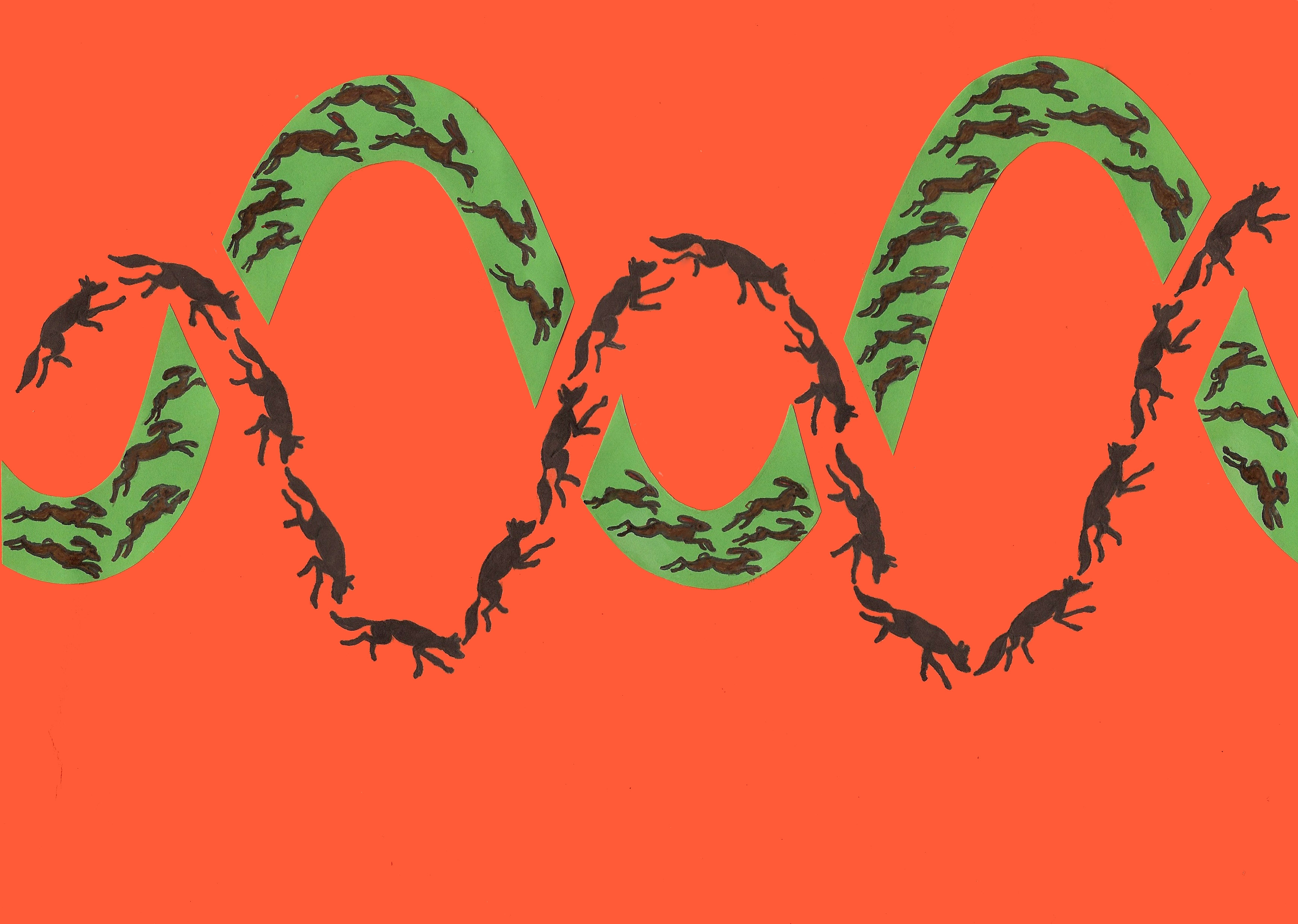
Other species also benefit as predator and prey numbers ebb and flow. Plants for example will escape total obliteration by hares and rabbits as predators reduce herbivore numbers. Without natural predation environments become less diverse as certain species are eaten beyond their capacity to regenerate. However, the predator prey graph is an oversimplification, and although the general principle holds true, the system is really a three dimensional web of life that demonstrates far greater complexity. We refer to a natural balance of nature, but the reality is closer to a series of peaks and troughs. If our human population followed closer to the logistic curve, modern technology would allow us to regulate against a roller coaster of loss and gain in a manner that can’t so easily be applied to the steep end of exponential growth.
Related closely to our population numbers is the extraction and burning of fossil fuels.
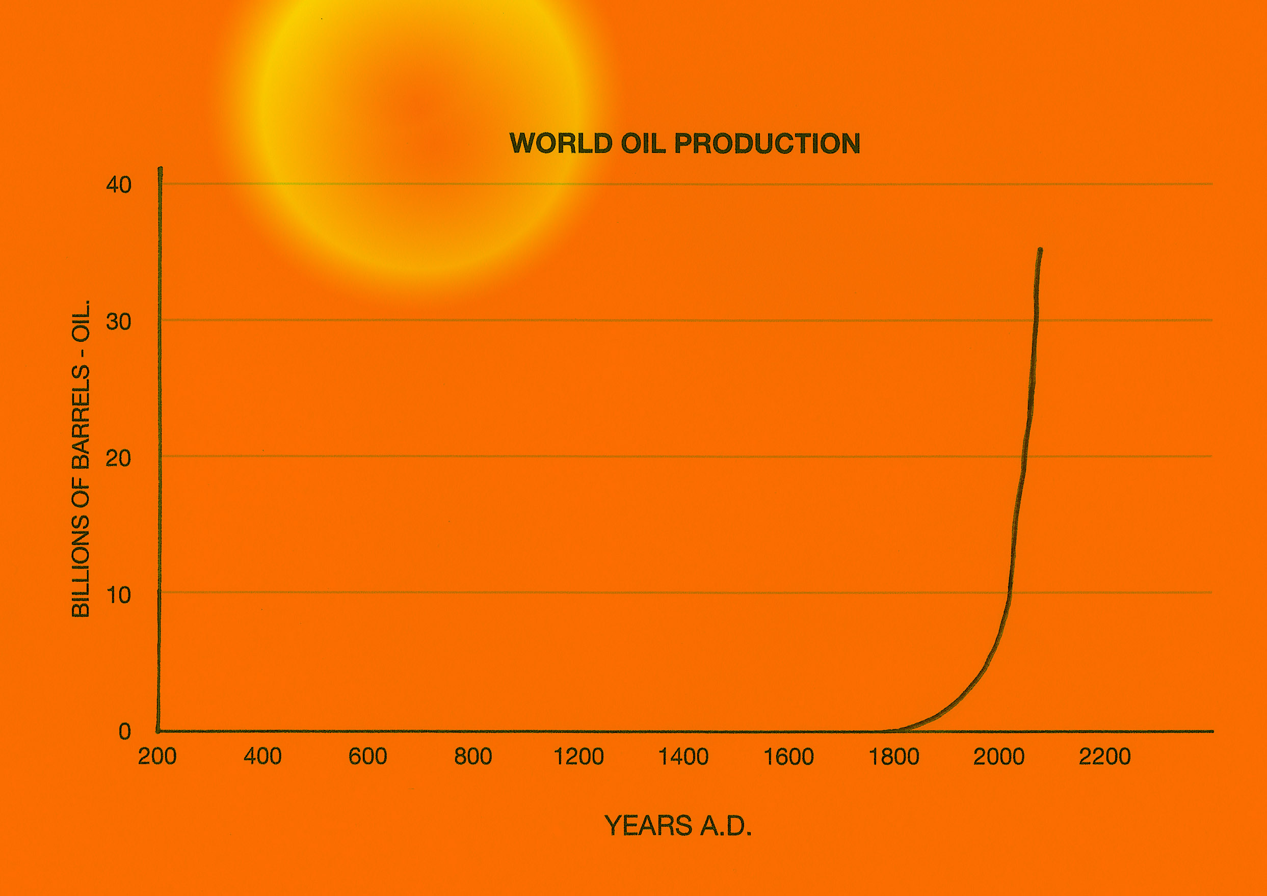
It is impossible for us to remove and burn fossil fuels indefinitely, because such resources are finite and as time passes, these diminish and become increasingly difficult to extract. And another consideration is the effect that burning fossil fuels has on our atmosphere should we decide to try it.
The increasing emission of carbon into the atmosphere when fossil fuels are burned is clearly changing the Earth’s atmosphere.
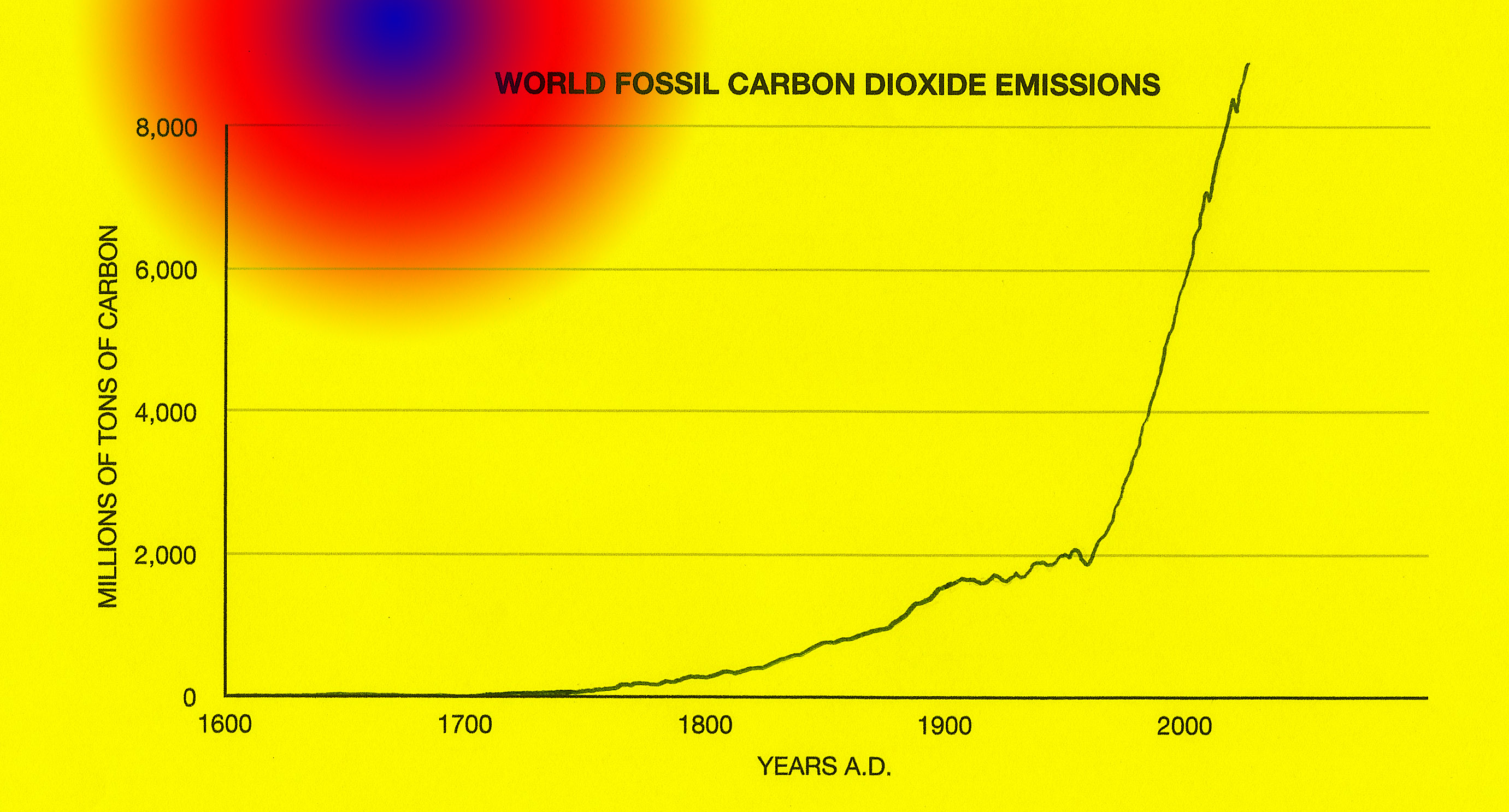
Burning fossil fuels has a special place in the grand scheme of things, because it increases the levels of Carbon dioxide in the atmosphere and that in turn increases global temperatures. Continuing to do so at an ever increasing rate not only changes the atmosphere, it also changes the weather and at a certain point these changes may be irreversible.
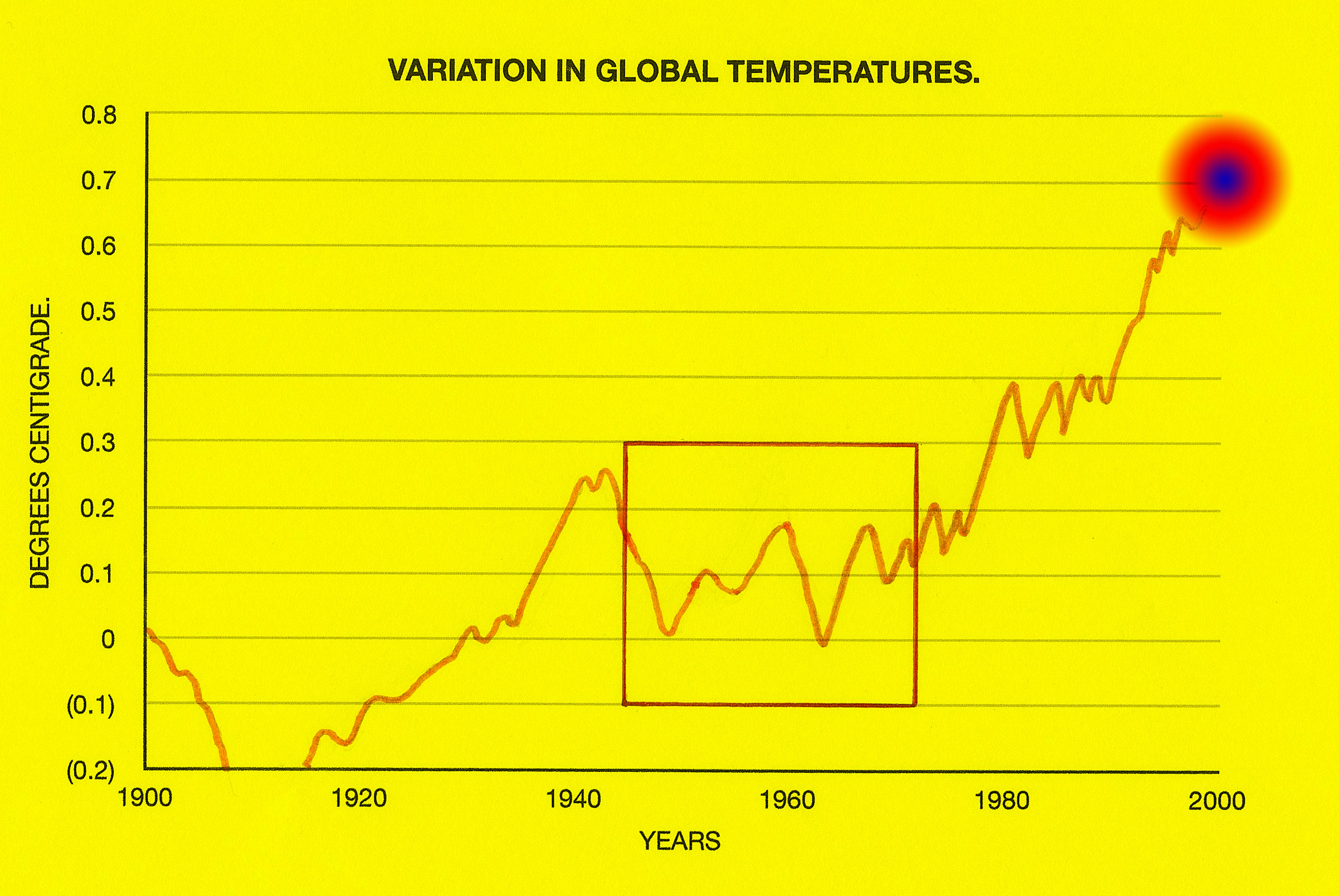
If you looked only at a graph showing the period between 1950 to 1970 you’d consider global temperatures to be fairly stable. There has also been a similar levelling of temperatures in recent years; these are the favoured areas for climate change sceptics to cherry pick their examples and tell us, ‘there’s nothing to worry about’, but unfortunately, there can be no denying the general temperature trend is upwards – the planet is warming, which supports the idea that it is necessary to always view the whole picture.
The Ebola infection figures discussed earlier do indeed appear to be growing exponentially (at the time of writing). The curve ran fairly level through May and June, which would have been the ideal time for the developed world to have moved in and defeated the disease before it took off. To have ignored this opportunity seems careless if not arrogant. The question is, if I can manage the calculation on the back of a cigarette packet (see below), why can’t those in power do the same. It would be generous to put the terrible suffering in West Africa down purely to ignorance, but sometimes it is suffering economies rather than suffering people that elicit the most rapid responses.
Below: an ‘on the back of a cigarette packet’ calculation derived from figures freely available from news reports. This was quite tricky – not the mathematics… it’s just that I don’t smoke.
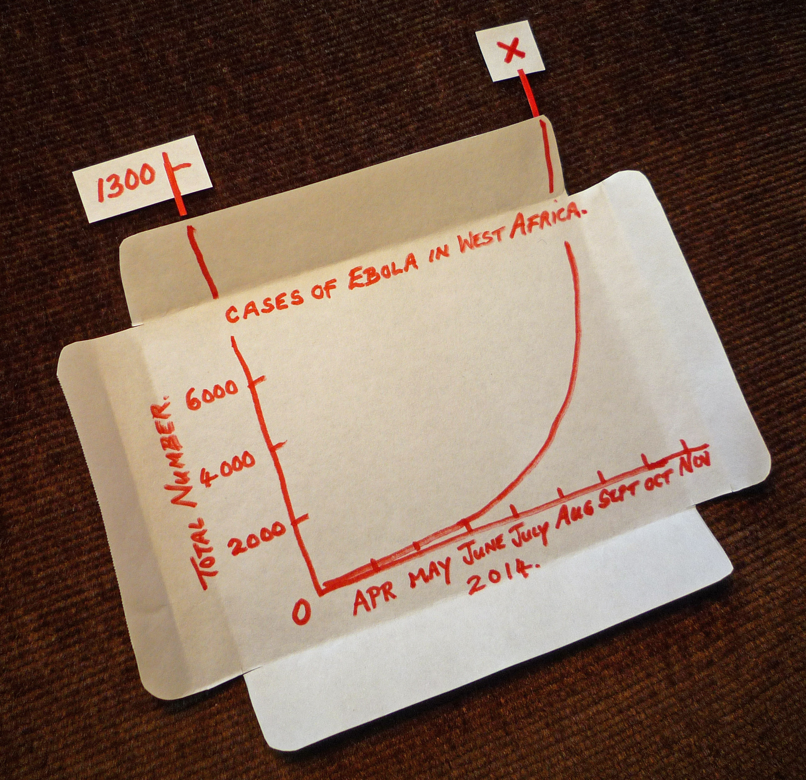
So far there have been around 5,000 deaths due to Ebola and there will be many more in the coming months, but hopefully, now that medical help is arriving in the affected West African countries (better late than never), the infection will begin to come under control.
Whenever we hear a spokesman say that ‘growth is exponential’ it is good to be clear about what he or she means. Certainly this is important when it refers to human population growth; or the increasing use of fossil fuels; and the rapid spread of a contagious disease. In each case we need to ask the right questions, then be certain that our answers make sense, and last but not least, act as quickly as possible – and so far we have been unforgivably slack on the last one.
The ciggy packet slip aside, all of the simple ‘mathematical’ pictures shown above have been colourful, and without exception are easy to interpret – this isn’t intended purely for the benefit of small children – it is also to grab the attention of the mathematically challenged politicians making important decisions; they really do need to, ‘get the picture, act in good time’, and in so doing, ‘save the planet’.
In mid October 2014 Tony Abbott predicted that coal would be the world’s principal energy source for decades to come. It was he said, ‘Good for humanity’. I wonder if I’m living in a parallel universe – Tony Abbott must be better informed than I am… he’s the prime minister of Australia.
At the time of posting there was some hopeful news. A decrease in the number of reported cases of Ebola in Liberia. WHO’s spokesman Bruce Aylward said the response to the virus was now gaining the upper hand, but warned the crisis wasn’t over. The Head of the U.N. Mission says that ‘presently he doesn’t have the resources to defeat the disease’. How nuts is that?
For a perceptive and amusing view of man’s destruction of the Planet, take a look at this cartoon:
http://laughingsquid.com/man-animated-short-showing-our-destructive-relationship-with-earth/


Can I use the image of Exponential Growth for my digital citizenship lesson?
Thanks,
-David
Hi David,
Certainly you can use the image. Thanks for your interest. Sorry for any delay I have been visiting the U.K. and haven’t managed to check my messages for a few days. All the best,
Stephen
Hi!
What is the source for the image on world’s population?
Best regards,
Leif
All of the graphs used in this article are my own, and based upon the most reliable sources I could find. The population graphs were mostly derived from U.N. estimates, although it is worth noting that by their nature these can only be projections; there is however a tendency when such figures are revised for human population trends to be higher than predicted – these are then extrapolations. If there were some form of disaster in the future that we were unable to cope with, the human population might well collapse and the graph no longer continue steeply upward; paradoxically, it is interesting to note that this is more likely to happen should we continue to ignore the current trend without reacting. Thank you for your question Leif, With all good wishes, Stephen.